Tuesday, June 29, 2010

Want a Bathtub That Rocks?


We try and provide ideas for your home here on Swell Dwellings. But there are times, and today is one of them, when we like to show you something we've found that's bizarrely intriguing. Cue some rock music.

I promise I'll stop using cheesy puns. But only just for today. But check this out. This is a bathtub made by Italian company Baldi, took six months to make, and costs a modest $790,310. She's made from a single giant quartz rock crystal. If it's any consolation, I think the fixtures come with it.

Baldi  Rock Crystal Bathtub


Thursday, June 24, 2010

8 Great Bathroom Color Combos

We've seen a lot of color schemes in both bathrooms and kitchens lately that are heavily doused in white, usually with a little splash of color. Frankly, we love this look, but there are also other color combinations you can use to make your bathroom stand out.


Green, white and black.


Lavender, silver and white.


This one might be my favorite (I have a thing for browns). Dark Brown and Yellow.


Pink and gray.


Turquoise and yellow.


Red and white. The White Stripes favorite scheme.


Brown, white and pink.


Turquoise, white, and natural wood.

Tuesday, June 22, 2010

Bathroom Inspiration from Hotels (but wash your own towels)

Sometimes all you need is a little inspiration. Today we've got just the thing: hotel bathrooms. If you're considering upgrading or renovating your bathroom, these beauties from various hotels might give you a little to think about. Granted, you'll have to wash your own towels and provide your own shampoo, but at least your bathroom looks good!


The Standard Hotel, New York, USA: Comes with maybe the best view a bathroom can get.


The Viceroy Hotel, Santa Monica, USA: Nice subway tiled walls and one of the funkiest vanities I've ever seen.


The Bellinter House Hotel, County Meath, Ireland: Maybe my favorite out of the bunch, the blue walls interacting with the brown wood floor and then the occasional pang of white from the fixtures...okay, I also have to mention the sparkling tile shower. Show stopper.


New Majestic Hotel, Singapore: We're seeing a trend with these freestanding tubs.


Hotel on Rivington, New York, USA: Mini tiles rule in this skyscraping lavatory. Notice also the clash of the sharp corners with the intentionally round mirrors.


Hotel Puerta America, Madrid, Spain: Now this is a crazy one. It looks like a futuristic posh bathroom.


Hotel St. Cecilia, Austin, TX: Hex tiles outnumber everything. More freestanding tubs. It's simple and lovely.


High Road House, London, UK: Who says it has to be separate? Minimize your displacement from bed to bath this way!


Hospes Hotel, Mallorca, Spain: Chrome accessories stand out from marble walls stand out from dark wood flooring. Sophisticated.


Hotel Sigtuna, Sweden: I'm loving the vanity in this one, but I also like the novelty of the heightened toilet tank.

Saturday, June 19, 2010

Before and After: Country Kitchen

Before and After's. I can't seem to get enough of them. I really hope you guys enjoy them as much as I do, and hopefully they even inspire you to pursue these remodels for yourselves. Today's B&A was showcased on Design*Sponge at one time and it's classy. What used to be a country kitchen with green walls and light wood cabinets is transformed into a vibrant space.


The most first thing you might notice is the cabinet color. We've seen a lot of people switching to white to give a more modern look as well as promote lighting through the kitchen.


Looking a little closer, the walls are also lightened up a bit, but the kicker for me comes two ways: 1) Contrasting, incredible looking polished wood countertops which are 2) Provided a beautiful backsplash with yet another color and element introduced into the kitchen: small grey tile.

The colors here really set it off for me. Once I stop staring at the countertops and turn my head up a little, I spot that tile and I'm floored yet again. Really great work!


Two last details I'd like to point out. The lighting fixtures are so simple that they don't get in the way of the rest of the kitchen when you look at it. But when you finally do see them, you can't help but notice the perfect matching with the splash tile, along with their simplicity.

The other thing is just a matter of decor. I'm a fan of stripes, and I'm a fan of yellow, so that roller blind is calling out to me right now. It helps to add just a pinch of color in the mostly-neutral space.

Alright I'm done talking! Just let the pictures speak to you!

Friday, June 18, 2010

How to Impress Dad on Father's Day

This will be a quick post. With Father's Day coming up, there's no doubt a need for thoughtful, original, and creative ideas. So when you go to/make/enjoy breakfast or brunch with the pops, here's a quick, simple, and neat little trick to impress him when he sits down at his plate...


It's a cute little polo shirt that's folded from his napkin! And nothing speaks 'dad' like a classy polo. Catch the six-step instructions (in photograph form) over at How About Orange.

Happy Father's Day!

Wednesday, June 9, 2010

What's Cooking Wednesday: Messy Moroccan Wings

The moment I saw these chicken wings on The Kitchn, I knew I'd have to post them on the blog and give them a try myself. I can't get enough chicken wings. Back in college the local joint Knute's would have 30 cent wing nights, and we would go every week. They always had at least 12 different sauces and rubs to pick from, but something I've never seen is a 'Moroccan' flavor.

060710-wings1.jpg

The Kitchn's got the goods over on their site, so give this flavor a try and let us know what you think! Hopefully your plate will end up like this...

060710-wings2.jpg


Tuesday, June 8, 2010

How Kohler's Inspiring Design: 100K House


In recent years, Kohler has gone above and beyond just making faucets to inspire design in everyone's home. A faucet isn't just a water spigot anymore. It's become a work of art. And so it should come as no surprise that Kohler is sponsoring a video series on Babelgum that showcases inspired (and inspiring) design.


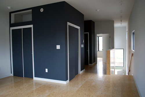
M&M House Second Floor 1 by postgreen.

One of the videos tells of the 100K house in Philadelphia. The creators of this house wanted a home that was fully sustainable for $100,000 dollars or more specifically, $100 a square foot. So using abandoned and dilapidated lots (of which there are 25,000 in Philly alone), they constructed a dwelling using outside, fully-insulated wall panels.

What comes out is a beautifully designed, simple, inexpensive, and fully sustainable home.


Skinny Project Rendering Web by postgreen.


It's nice to see Kohler putting their money into something that's more about the people and great design than it is about Kohler. We're glad to carry them!


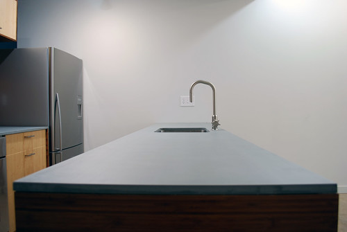
M&M House Ecotop Counter by postgreen.


You can learn more about the 100k house mission and products at www.100khouse.com

Saturday, June 5, 2010

Getting the Most Out of Your Kitchen

My mom can get a lot out of a kitchen with just an oven, a cookie sheet and maybe a few pie pans, with all the necessary ingredients, but even these necessary ingredients and measuring cups, utensils and supplies require a decent amount of storage space. A decent amount of storage space sometimes requires a pile of money. And then there's the issue of making sure it still looks good! (Instead of straight out of an episode of Hoarders)  So what if your space is limited and you're on a tight budget?

Apartment Therapy recently put up a great post on smart kitchen design that utilizes kitchen space to get the most out of it. It was so great in fact, that we'd like to share it with you here on SD.


Airspace: This kitchen uses a shelving system above the island to store extras. A lot of times kitchens will keep the space above an island for lighting, or nothing at all, so shelving in this 'airspace' (if it works for your kitchen) is a good call.


Pulls and Paint: Your kitchen update might just require a new paint job and some fresh pulls. Depending on when your kitchen was installed, you might have some fairly old pulls hanging off your doors and drawers, and renewing them is cheap and does a wonder to your kitchens appearance. And we've had plenty of kitchen before and afters on Swell Dwellings to know how far a coat of paint can go to liven up the space.


Reuse and Recycle: A little thinking outside the box can turn up some different but great looking solutions, like in this kitchen from Megumi, where old metal filing cabinets were reused as cabinet space. This creates a whole new rugged look, and is a conversation piece to boot!


Embrace the Era: This kitchen's cabinetry had a vintage feel to it, so instead of ripping them out and installing new, more current cabinets, the owner embraced them. Adding a vintage range and checkered floor, the kitchen speaks to its roots (and it still looks great).


Small Space? Big Pattern!: The last of Apartment Therapy's tips recommends a knock em dead pattern on at least one of your walls. Most kitchens can be worked with as far as design and space, but if you want a quick solution, or don't feel like your kitchen as much to work with, do wonders on your walls! Wall papers and pattern stencils make art out of one or more of your walls. Tons of options can be found on the web, but check out Fine Little Day to get you started. Elizabeth Dunker runs this site, and her 8 year old son Otto draws a lot of the wallpapers. It's pretty awesome.

Friday, June 4, 2010

From Brick to Chic: Kitchen Before and After


We've got another kitchen that brightens up this week, with Kerri's kitchen remodel. She had this dank looking brick and timber kitchen for a while, and apparently she made this transformation with less than $500. She relied on a trusty spray gun and covered the brick up with some nice white faceboard. It's a nice country do-over that hopefully inspires you to work on your kitchen! It doesn't take much!


Tuesday, June 1, 2010

5 Gray Bathrooms for Post Long-Weekend Woes

Three day weekends are a thing of great joy and wonderment. The Tuesday after a beloved three days off is the cause of great misery and remorse. And for that, we've got the color gray! I bet you feel better already!


But Color Expert defines gray besides the cloudy gray gloom and doom we might be used to:

"Gray is timeless, practical, and solid. A longstanding favorite suit color, gray can mix well with any color."


But Color Expert then unloads the common conception:


"Although well like and often worn, people rarely name gray as a favorite color possibly because Gray also is associated with loss or depression."


So where's this all going? Well, when it comes to your home, in pretty much every case, gray will be the timeless, practical, and solid color you're looking for. It's one of those neutral colors that are the easiest to match up with. And to show us how to pull it off, we've got 5 gray bathrooms that make a gray statement, but aren't associated with loss or depression!


Some of these kind of kick the old gloomy gray stereotype out the window by involving a lot of white and a lot of light, like the one above, which uses gray walls to define the blinding white of the rest of the room.